
No. 04 — Lost & Found Animal Foundation
Showing peoplethe animals first.
Lost & Found Animal Foundation is a Las Vegas animal rescue. Its old homepage opened on a stock family photo, so we rebuilt it around the animals.
It was all on the site,just not in the right order.
A rescue doing real work, with a website that wasn’t keeping up with it.
The rescue takes in animals that have been abandoned, surrendered, injured or simply left with nowhere to go, gets them healthy and finds them homes. Fosters, volunteers and donors keep all of that running.
The old site had the information, but nothing told a visitor where to start. The main menu ran to ten items, and the strip above it was packed with the full street address, phone number and tax ID number.
So the site technically explained what Lost & Found did, but it didn’t feel like the organization behind it. The animals, the whole reason the rescue exists, were easy to miss.
The old homepage opened on a family.The dog was barely in the picture.
The old sitenext to the one we built.
The biggest change is what a visitor sees first, and where they can go from there.
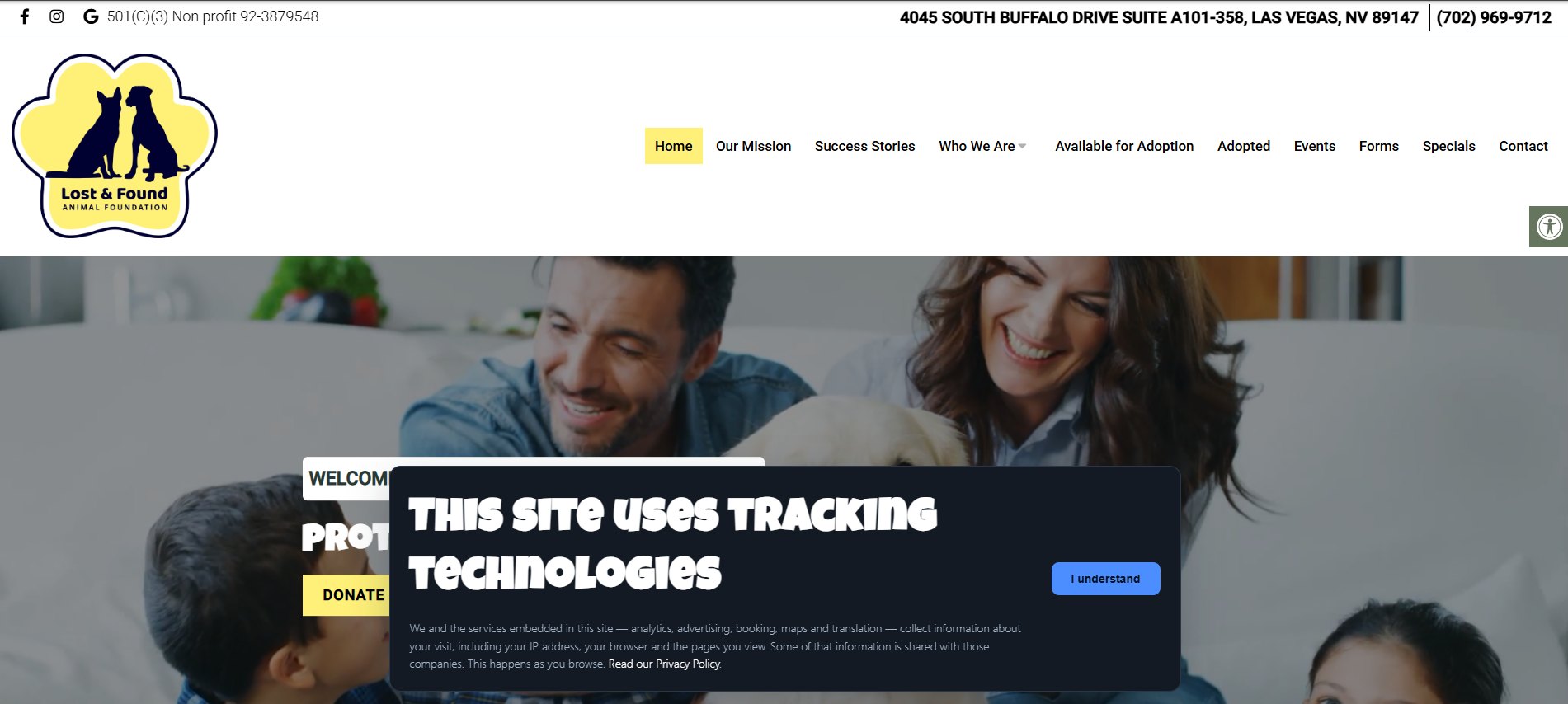
Ten items in the main menu, and a stock family photo where you might expect a rescue animal.
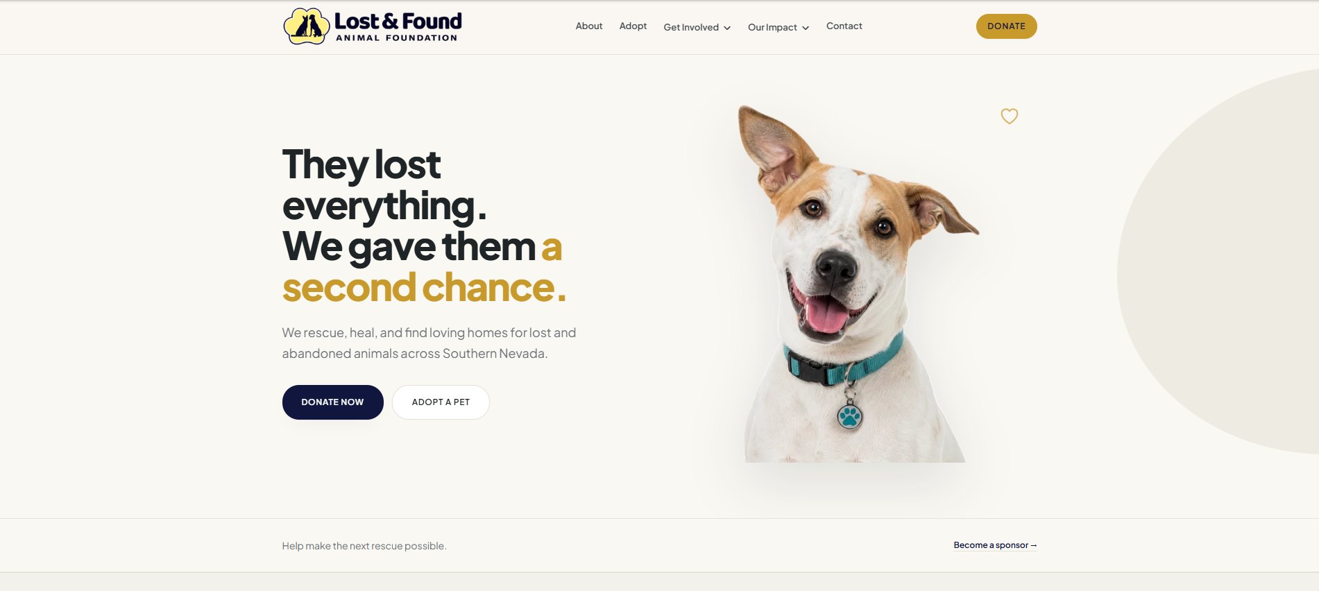
Five menu items with a gold Donate button beside them, one dog, and Donate Now and Adopt a Pet right under the headline.
We kept the paw logoand deepened the yellow.
Supporters recognize that paw badge and that yellow, so we refined them instead of starting over.
The palette
The old site put bright yellow on the logo, the menu and Donate. The logo keeps it; elsewhere we deepened it to gold for the header Donate button and “a second chance.”
The typography
Their story isn’t over yet.
Every animal deserves to be seen.
The principles
The organization deals with hard situations every week. The site had to hold that honestly while still pointing at what a visitor can actually do.
The homepage now leadswith a dog and a headline.
We moved the focus off the organization’s details and onto the animals it helps.
A visitor arriving for the first time should learn three things before scrolling: who the organization helps, why the work matters, and what they can do about it. The homepage answers all three in the first screen.
“They lost everything.We gave them a second chance.”
Headline on the live homepage
We let the photo do most of the work. The dog takes the right half of the screen on a plain cream background, and the type and colors stay quiet enough that nothing competes with it.
Every kind of visitorgets a clear place to start.
A rescue website serves adopters, donors, fosters, volunteers, sponsors, people who need to surrender an animal, and everyone following along. Each one arrives wanting something different.
The stories were there.Now they’re on the homepage.
Every adoption story now follows the same format, so they read as one collection.
Each one gets a photo, the animal’s name and breed, a short title and the opening of the story, laid out the same way every time. Care guides, rescue updates, community news and events each have a regular place on the site too.
For a rescue, those stories do a lot of the persuading. Someone deciding whether to adopt or donate wants to know what happened to the last animal, and a page of real adoptions answers that better than a paragraph about the mission.
Your best proof doesn’t help much if people have to go looking for it.
Helping out shouldn’tstart with a phone call.
Someone who wants to help usually has one question, which is what to do next. Adopt has its own page in the main menu, Donate sits in the header, and Foster, Volunteer and Sponsor each get a page under Get Involved.
Anything that doesn’t fit those, like needing help with a pet, goes through a contact form that asks what the message is about. None of it requires a phone call to figure out. The aim was less friction between somebody wanting to help and actually helping.
How the site is put together.
- Works on a phone
- We designed for the phone first, then worked up to larger screens.
- Success stories
- A repeatable format for adoption outcomes, so every one is told the same clear way.
- Adoptable animals
- Each animal gets the same layout, so the list stays easy to browse as animals come and go.
- Ways to help
- Donating, fostering, volunteering and sponsoring each have a page you can reach from the main menu.
- Search and accessibility
- Proper headings and page descriptions so search engines understand each page, and text with enough contrast to read easily.
The new site is live,so you can see it for yourself.
It’s the rescue’s website today, linked at the top of this page. These are the changes a visitor notices first.
- Purpose up front
- What the rescue does is spelled out in the first screen.
- Animals first
- A dog leads the homepage, and adoption stories follow further down.
- Clear ways to help
- Adopt and Donate are on the first screen, and every other way to help is in the menu.
- Easy to add to
- New stories and events slot into pages that already exist.
Send us the siteyou’re not sure about.
Add a note about what it should be doing that it isn’t. We usually start with what people see before they scroll.
Next project
All work →