
No. 02 — Beauty / Hospitality
MajaSalon & Spa
A longtime Las Vegas salon with an established brand. Its website needed to show new clients the actual salon and make booking much easier to find.
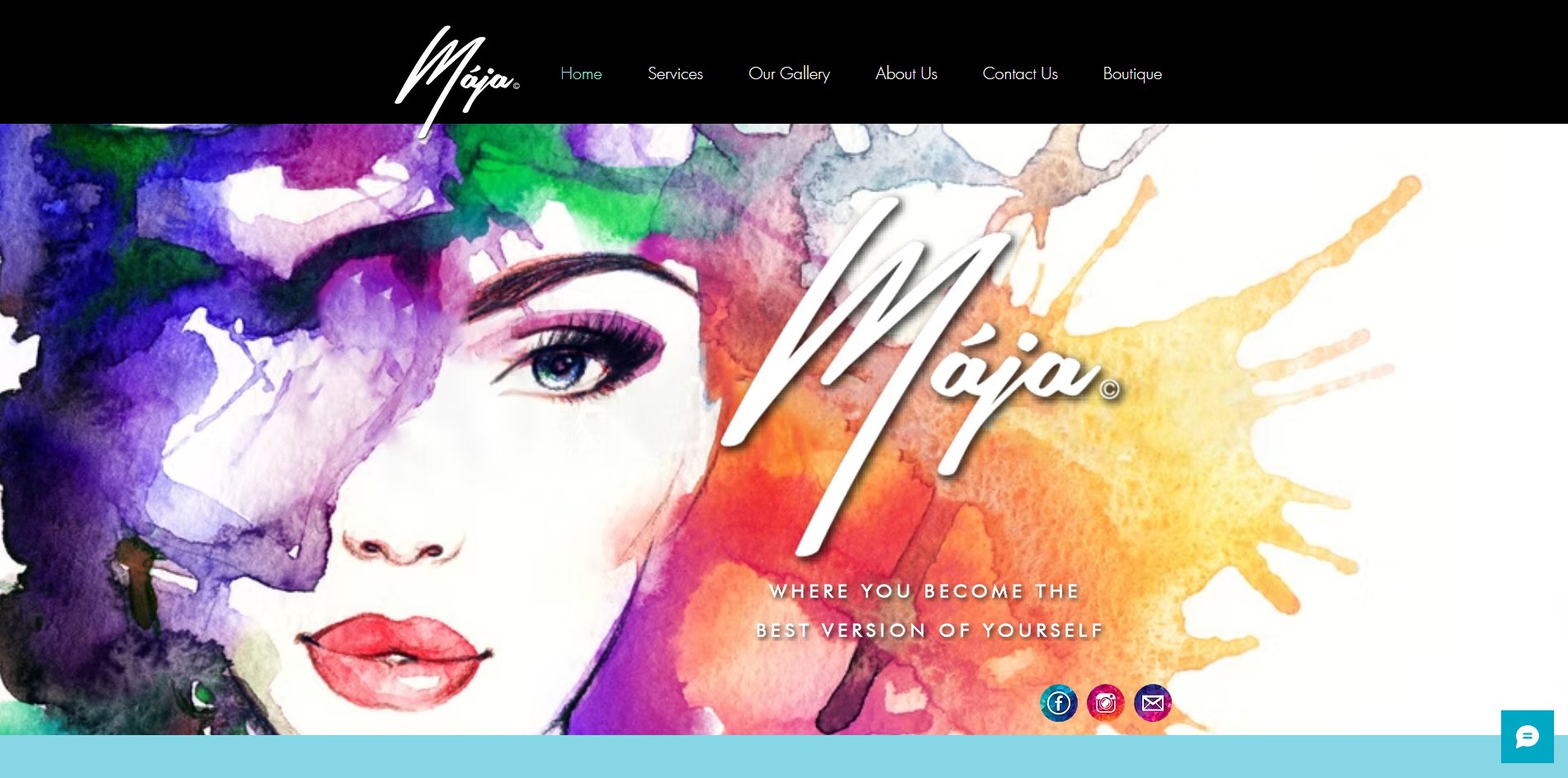
The old website.
The original Maja website had personality, but it had fallen behind the business. The homepage was a watercolor illustration of a woman’s face with a big script logo across it. Nothing on that first screen showed the salon, and there was no button to book.
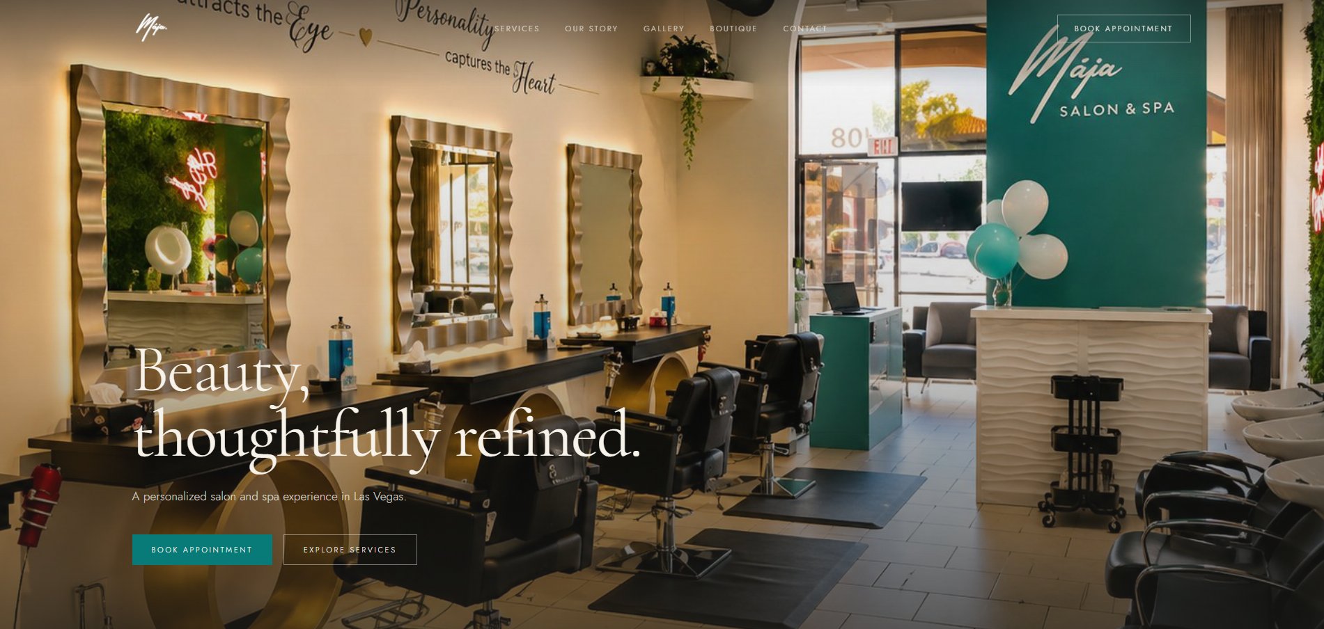
The salon became the homepage.
We kept the recognizable Maja identity, but changed what the website emphasized. The homepage now opens on a photo of the salon, with the same script logo on its teal wall. A new client can see what the place is like before their first visit.
Booking in plain sight.
On the old site you had to hunt for a way to book. Now Book Appointment stays in the top menu, and the homepage gives two options: book right away, or look through the services first if you’re not ready yet.
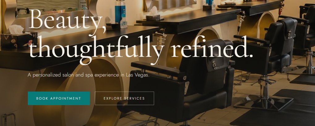
- Main buttonBook Appointment
- Second buttonExplore Services
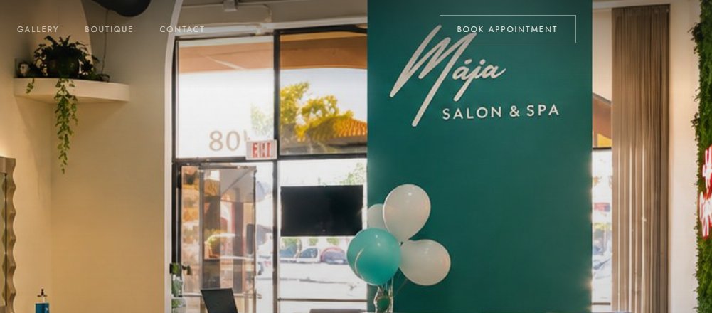
- Top menuBook Appointment on every page
Everything elsegot simpler.
Picking a salon is personal, so the website should feel like the salon. We cleaned up the type and cut anything competing with the photos or the Book Appointment button.
- Real photography
- The salon itself is the pitch, so we used photos of the real space.
- Easier to follow
- One message per screen, in the order a new client asks the questions.
- Booking in reach
- Book Appointment is never more than a glance away.
- On a phone
- We designed for the phone first, then worked up to the desktop layout.
Same Maja, with abetter first impression.
The name and logo were already doing their job, so we kept both. All of the work went into the website: what a new client sees first, and how easily they can book an appointment.
Now the salon leads instead of hiding behind its logo. If your website looks older than your business, and the brand is worth keeping, a redesign like this is usually the right place to start.
Next project
All work →